There are three types of charts that are popular in the world of Forex trading, namely:
Line Graph (Line Chart)
Bar Graph (Bar Chart)
Candlestick chart (Candlestick Chart)
Well, now let's learn three types of graphs that will be familiar with our eyes.
Line Graph
This simple line graph displays the line from one closing price to the next closing price. When linked by one line, we can see the general movement of the price of a currency pair at a time period.
Here is an example of this graph:
Bar Graph
Bar graphs are slightly more complex than line graphs. He shows opening and closing prices, following the highest average and lowest price of a currency pair. The bottom of the vertical bar indicates the lowest price in the current trading period, while the top bar shows the highest price paid.
The vertical bar itself represents the range (trading) of a currency as a whole.
Horizontal shrinkage on the left side of the bar shows the opening price, whereas the tangle on the right side indicates the closing price.
Here is an example of a bar charts:
The note that we should take note of this lesson is the word bar refers to a piece of data on a graph.
A bar simply represents a segment of time, whether it is a day, a week, or an hour. When we see the word 'bar' moving forward, make sure we understand which time frame is meant by the bar.
The bar graph is also called the "OHLC" graph, because it represents Open, the High, the Low, and the Close of a particular currency. Here is an example of a price bar:
Open: a small horizontal line on the left representing the opening price.
High: the vertical line peak that represents the highest price in any given time period.
Low: the bottom of the vertical line showing the lowest price at any one time period.
Close: a small horizontal line on the right representing the closing price.
Candlesticks Charts
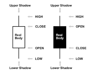
The information provided by candlestick is not much different from the bar graph. It's just that this graph gives a more interesting variations of graphics format than its two predecessors. Candlestick still shows high-to-low price movements through vertical lines.
The difference is in the candlestick chart, the center of the wax bar in the center shows the distance between the opening and closing prices. Simply put, if the center contains or color indicates the currency is closed (closed) lower than its opening price.
In the example below the filler color is black. For the colored blocks, the top portion of the block is the opening price, while the bottom of the block is the closing price. If the closing price is higher than the opening price, then the middle becomes "white" or empty.
The color difference in candlesticks also has other benefits, and not just as a boring graphical banner. By paying attention to the colors on the candle, we can read the graphics faster. For example, we will immediately recognize up-trend or downtrend, or even see signs of reversal will occur, by noticing the color of the candle.
Here is an example candlestick chart for pair EUR / USD
The main purpose of candlestick chart is to overcome the trader's boredom.
"As simple as that?!"
Oh, come on ... do not tell me you guys are not tired of seeing the up and down lines and bars moving on the computer screen. Must be boredom in us. Well, here's where the candlestick chart benefits. Because basically the information displayed by candlestick and OHLC is not much different. But in general candlestick have advantages over two other graphs, namely:
Easy to read and analyze. So a perfect chart for beginner traders and those new to trading Forex.
Easy to use. Our eyes soon adapt to the information in the bar notation. The results of research also proves something that will visually facilitate a person's understanding. Who knows, we can take advantage of this in trading.
The names of kece candlestick chart patterns make it easy to remember the meaning of the pattern. For example shooting star.
Great for identifying changes in market direction (reversal), from up-trend to down-trend, or vice versa. But we will learn this later.


Tidak ada komentar:
Posting Komentar